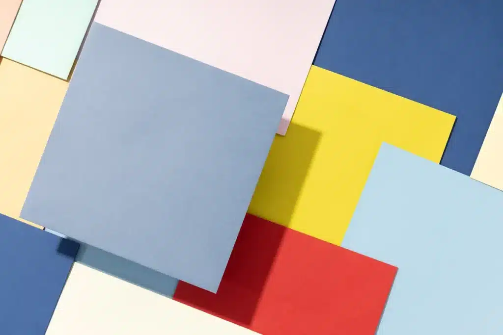
Why Care About Colour Combinations?
Colour combinations play a crucial role in graphic and product label designing. They can create a desired mood, attract attention, and convey information effectively. Understanding the impact of different colour combinations with your ink and paper selection can significantly enhance the effectiveness of your design.
Creating the Right Mood
Warm Colour
Palettes: Using warm colours like red, orange, and yellow can evoke feelings of excitement and energy. They are often used to grab attention and stimulate emotions.
Cool Colour Palettes
On the other hand, cool colours like blue, green, and purple can create a sense of calm and relaxation. These are ideal for designs that aim to soothe and provide a tranquil experience.
Attracting Attention
Bright Colours
Bright and bold colours can easily capture attention. They are perfect for highlighting important information or making a product stand out on the shelf.
Muted Colours
Muted and subdued colours, such as pastels, can convey sophistication and elegance. They are suitable for high-end products and brands that want to present a refined image.
Avoiding Poor Colour Combinations
Just as important as knowing which colours work well together is understanding which combinations to avoid. Poor colour choices can result in designs that are jarring, difficult to navigate, or simply unattractive. Although the suggestions below are not hard and fast, it’s important to understand potential issues.
7 Colour Combinations Which Can Be Problematic
Yellow and Green
While both colours are popular individually, they can be jarring when used together. This combination can create a cheap and unprofessional look, making it harder for users to navigate your design. Of course, the Australian made logo is the notable exception to the rule, but mainly because the right shades of both colours have been utilised.
Brown and Orange
Both brown and orange are fairly dark colours, which can sometimes make text hard to read. This combination can detract from the focus of your design and fail to highlight important elements. Brown and orange usually represent two separate ideals. Orange is bold and clean, brown is subdued and earthy.
Red and Green
The primary issue with this combination is accessibility. People with red-green colour blindness cannot distinguish between these two colours.
Additionally, red and green clash visually, creating an unsettling effect and reducing the overall conspicuousness of the design. This can lead to issues with regulatory compliance, as packaging must ideally have clearly visible text.
Purple and Yellow
Purple and yellow are complementary colours, but their high contrast can be overwhelming and visually straining if not utilised correctly. This combination can easily overpower other elements in the design and make it difficult to focus on the overall content.
Blue and Red
These colours can clash and create a disorienting effect. The combination can make text hard to read and reduce the overall clarity of the design. If you’re firm on this colour combination, try using them in separate elements, rather than red text in blue blocks, or vice versa.
Fluorescent Colours
While fluorescent colours can attract attention, using too many fluorescent colours together can be overwhelming and garish. This can detract from the professionalism and legibility of the design. Using just one fluorescent colour for a bold text heading is usually a better option.
Dark Colours on Dark Backgrounds
Using dark colours on dark backgrounds can make text and important elements hard to see. This reduces readability and can frustrate users, making the design ineffective. Always keep in mind that dark colours on dark backgrounds always look better on a computer monitor or digital proof than when printed.
By carefully selecting and avoiding certain colour combinations, you can create designs that are visually appealing, easy to navigate, and effective in communicating your intended message.
At Simply Print, we can help you choosing the right colours to communicate your business to the market place. Contact us, we’re here to help you.


